Holy Cannoli
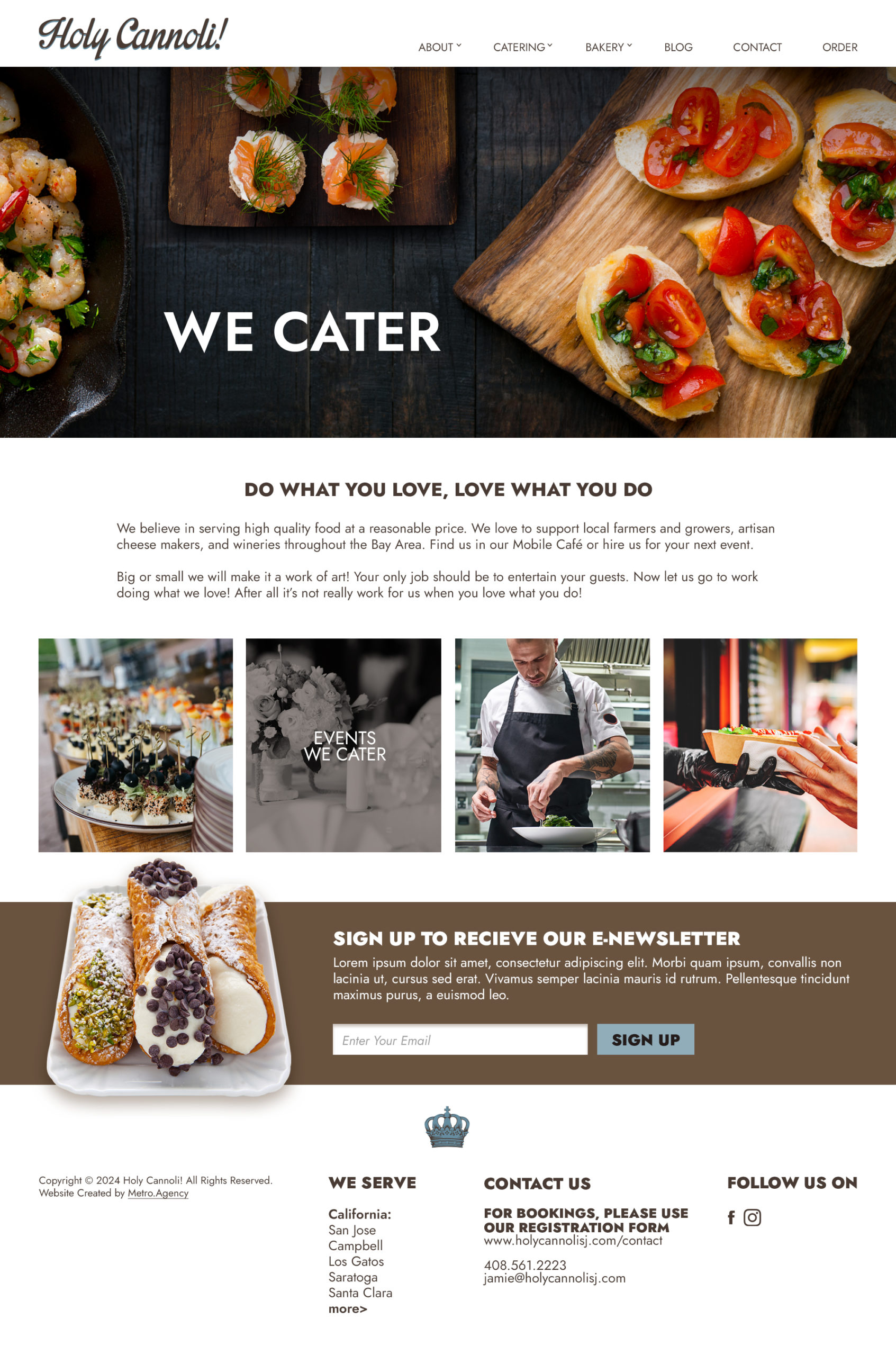
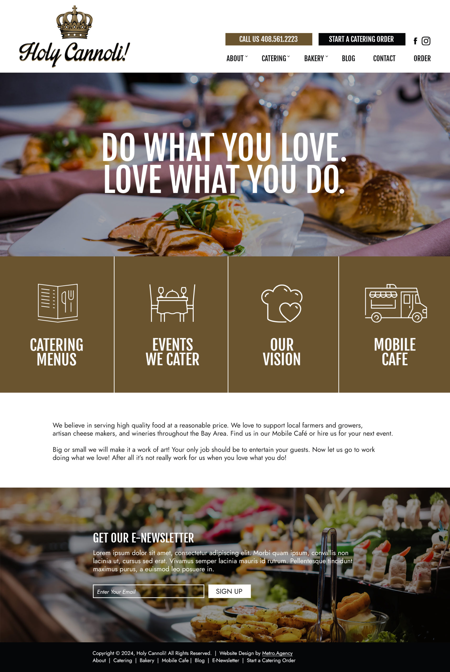
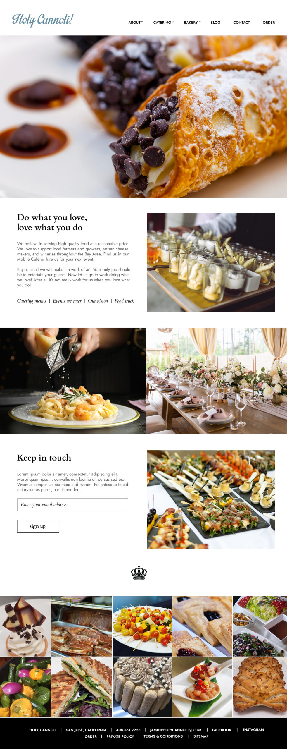
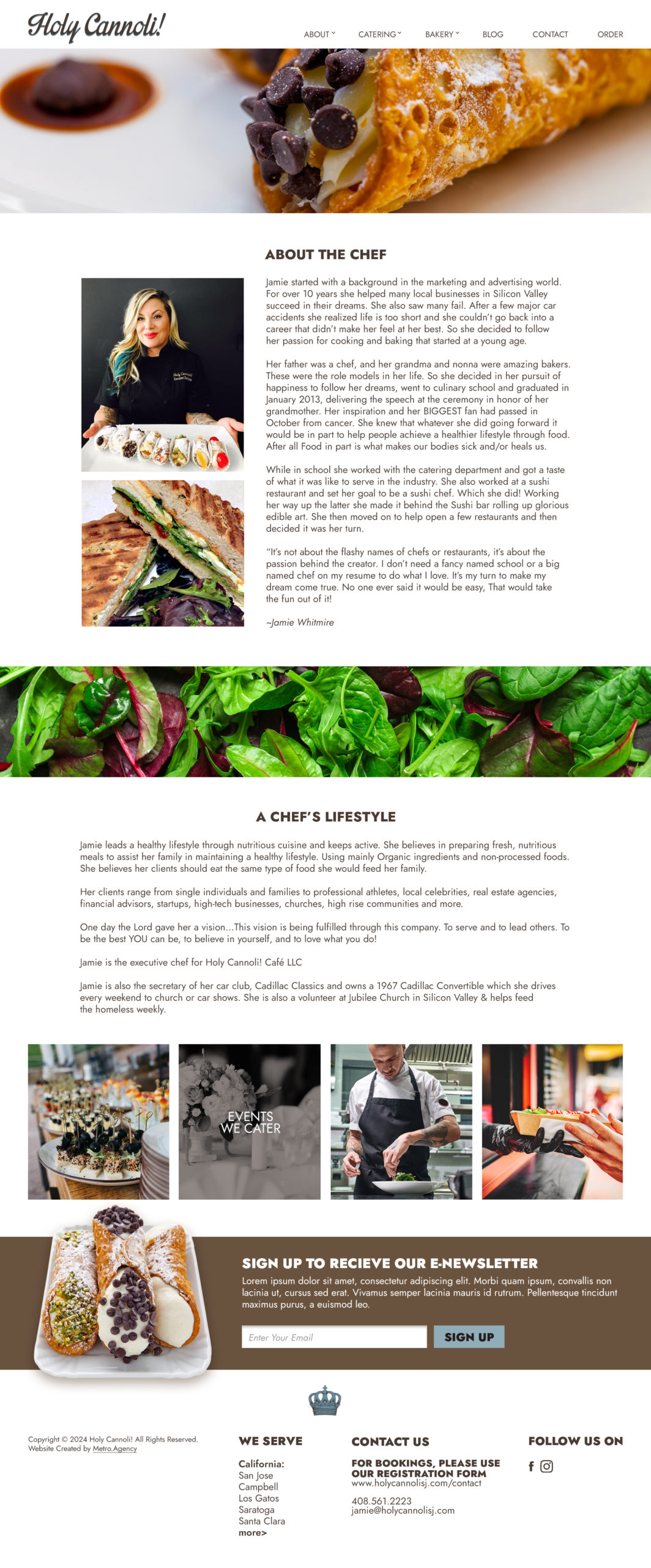
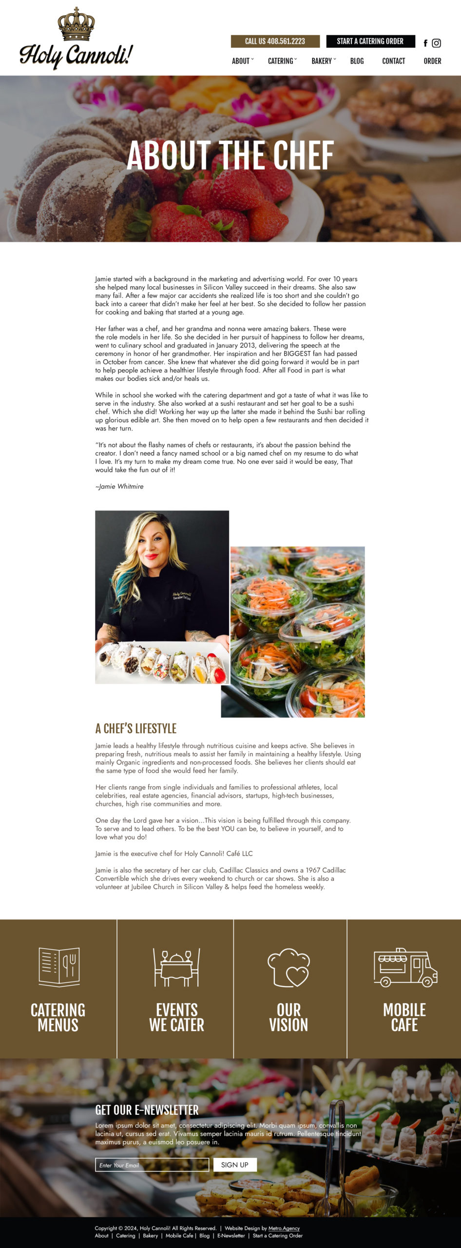
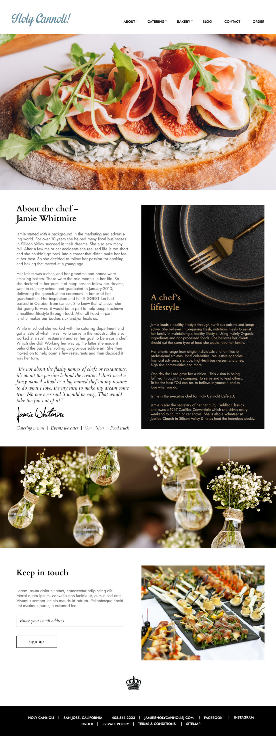
Please review the designs and decide which direction you’d like to go, and any feedback that you have.
The mockups are just static images, just to determine the direction of the design. None of the moving or interactive features will be working at this point. Once we decide on a direction for design and incorporate your input, we will build the site in WordPress, and at that point all the interactive features will be made to work.
Notes About Designs
Design 1
The top image on the Home page will be a slideshow
On the Design 1 home page, there are four images partway down the page. These are “rollovers” – when the user moves the mouse over the photos, we’ll show a title; when the user clicks that image, we’ll go to the appropriate interior page. This acts as a secondary form of navigation to draw users deeper into the site (all of the pages can also be reach from the dropdown menus at the top of the page).
Design 2
The top image on the Home page will be a slideshow
Design 2 uses your current logo (crown and text). Dan Pulcrano suggested splitting the logo, so on Design 1 and Design 3, we used the text portion at the top of the page, and moved the crown to the bottom. We can use either option on any of the designs.
Design 3
The top image on each page will be a “parallax” image (the content will scroll past it). If you’re not familiar with how parallax images work, there’s an example at:
https://acquolinacatering.com/
Please review the designs and let us know if you have any questions. (Click to see the full images, or use the button above to download ALL the images.)
When you are ready, we will schedule a Zoom meeting to review your feedback.